However, there are a handful of wine companies who really go that extra mile when it comes to designing and printing labels for their bottles. Here are some of my favourites.
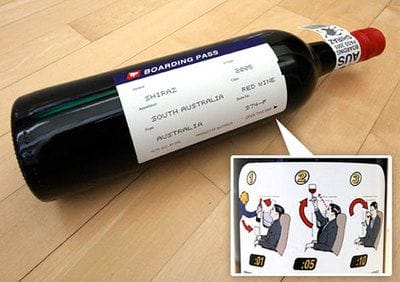
Many people indulge in a bottle of wine during a long flight and this exceptionally creative label design makes that experience even more fun. The wine label is essentially designed in the style of a boarding pass with essential boarding information replaced with wine information. It looks great and no doubt goes down well onboard.
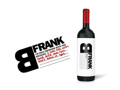
This label is only half designed for you; you have to do the other half yourself. B Frank Wine allows you to fill in the label yourself and let your co-drinker know why you're drinking with them. For example, "I'm only drinking with you becauseI'm about to fire you and you don't know it yet". The design is minimal and makes drinking a great wine even more fun!
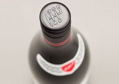
Elderton Wines of Australia has bottled a wine in tribute to auto (and wine) enthusiast Neil Ashmead. The Neil Ashmead GTS, or "Grand Tourer Shiraz" features a racing-styled label bearing Ashmead's signature. The bottle's coolest attribute, however, is its' six-speed stick shift screw-on cap. It just makes you want to grab it like a gear shift and pretend to drive!
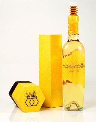
Lauren Golembiewski created the Honey Moon Wine concept as an annual gift to past and prospective clients in celebration of a budding summer. The "honey moon" is the first full moon of the month of June, known as the perfect moment to begin the harvest of honey. While the bottle is certainly an achievement of its own, Golembiewski also created the honey moon font to go with the label.
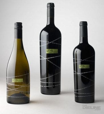
The designers at Laughing Stock Wine took a literal approach to designing their label. A stock ticker twists and wraps around the bottle, displaying the basic details of the wine contained within - very quirky. The name of the wine is displayed as a stock symbol, "LFNG", with the vintage year below it. In all, the design does an excellent job of conveying the character of the brand.
Do you have a favourite label?
 "Kellie Williams") Author:Kellie Williams
Author:Kellie Williams| Tags:MarketingPackage design |
PHONE0400 270 806
ADDRESS56 Fourth Street, Home Hill,
Queensland, Australia, 4806
POSTAL ADDRESSPO Box 32, Ayr, Queensland,
Australia, 4807
 "The Golden Ratio")
| Posted in:Logo DesignGraphic Design |
 "Photo formats")
| Posted in:ComputersPhotography |
 "Cool colours")
| Posted in:Logo DesignGraphic Design |
Home | Contact Us | Site Map | Print this page | RSS | |
