 "4 signs of a great logo design")
Your logo should stand out and be recognized among others in the same market place. And keep in mind that a logo doesn't necessarily need to say what a company does. "The Mercedes logo isn't a car. The Virgin Atlantic logo isn't an aeroplane. The Apple logo isn't a computer," writes graphic designer David Airey on the popular logo design site Logo Design Love. So don't feel like your coffee shop's logo needs to show coffee beans.
![]()
Strong logos translate well across different mediums. Will your logo have the same meaning on a business card as it will on a billboard? "Keeping the design simple allows for flexibility in size," writes Airey. "Ideally, your design should work at a minimum of around one inch without loss of detail." When a logo does not reproduce well on a small scale it causes problems for your brand's clarity and value. Also keep in mind that it should reproduce well when faxed in black and white, and when embroidered on your work shirts.
![]()
Who is your target audience? A logo needs to accurately reflect a company's culture and values: the company's essence. "Designing for a lawyer? Ditch the fun approach. Designing for a kid's TV show? Nothing too serious," writes Airey. Doing some market research is critical, too. Colour can be a major attribute in determining the appropriateness of a logo design. We all know that different colors are associated with different meanings in different cultures. It's important to think about how the colors in your logo reflect your brand values and the services or products you sell.
![]()
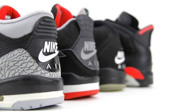
In 1971 graphic design student Carolyn Davidson designed Nike's 'swoosh' logo. In 1995, Nike began using the stand-alone Swoosh (without the lettering) as its corporate logo, and continues to use it that way today. It's the neutrality of a design that makes a logo timeless - clean lines, modernist structure and neutrality.
 "Kellie Williams") Author:Kellie Williams
Author:Kellie Williams| Tags:Logo Design |
PHONE0400 270 806
ADDRESS56 Fourth Street, Home Hill,
Queensland, Australia, 4806
POSTAL ADDRESSPO Box 32, Ayr, Queensland,
Australia, 4807
 "The Golden Ratio")
| Posted in:Logo DesignGraphic Design |
 "Photo formats")
| Posted in:ComputersPhotography |
 "Cool colours")
| Posted in:Logo DesignGraphic Design |
Home | Contact Us | Site Map | Print this page | RSS | |
