KerningWritten on the 26 July 2013 by Kellie Williams 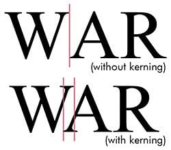 "Kerning")
A typeface design, no matter how good, is not at its most effective without the sensitive adjustment of letter spacing. Kerning is one of the components of letter spacing. In typography, kerning refers to adjusting the space between characters, especially by placing two characters closer together than normal, usually to achieve a visually pleasing result. In the days when all type was cast metal on wooden blocks, notches were added to the blocks to make them sit closer together. These days of course, we do it with computers. Kerning is most necessary in large headings and logotype design. If letters in a typeface are spaced too uniformly, they make a pattern that doesn’t actually 'look' uniform enough. Gaps occur, for example, around letters whose forms angle outward or frame an open space (W, A, Y, T). In the digital typefaces used today, the space between letters is controlled by a table of kerning pairs, which specify spaces between different letter combinations. So when you pick a font, mind the gap, especially when using fonts in larger sizes. This article was published in Zoom in Business Magazine Issue 7  "Kellie Williams") Author:Kellie Williams Author:Kellie WilliamsAbout: Kellie studied Commercial Art over 25 years ago at James Cook University and has been working in the Printing and Media industries ever since. She has worked for screenprinters, printing companies and newspapers in North Queensland and now runs her own business, Jasper Design, servicing Qld and interstate clients. Connect via:LinkedIn |
PHONE0400 270 806
ADDRESS56 Fourth Street, Home Hill,
Queensland, Australia, 4806
POSTAL ADDRESSPO Box 32, Ayr, Queensland,
Australia, 4807
 "4 signs of a great logo design")
| Posted in:Logo Design |
 "Pick a Font - Car Signage")
| Posted in:SignageMarketingCar SignageUSP |
| Posted in:MarketingPackage design |
Home | Contact Us | Site Map | Print this page | RSS | |
