Which Font to PickWritten on the 1 June 2013 by Kellie Williams 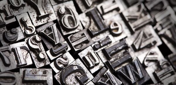 "Which Font to Pick") Picking the correct font for your document or logo can be quite tricky. Like colours, fonts have 'personalities' Some are cool and funky, young and fresh, some are messy or neat. Some are old school or even old fashioned. Getting your message across can be easier if you choose the right font. It can be hard to avoid the cliches when you want to choose a font that reflects your message or business personality (Comic Sans for a kindergarten, Century for a lawyer's office) but as there are so many fonts available on the internet these days you shouldn't have any trouble finding one that is right. When you do pick your font it is important to stick to it throughout your communication. Being consistent helps with your brand association. Most reports and brochures look best with only 2 different fonts, this way they don't end up looking like a mish-mash. One serif and one sans serif font are always a good combination. Or one fancy and one plain. The most important thing in getting your message across is readability so if you do choose a font that is a bit 'fancy' show it to a few other people to make sure they can read it. Finally, it's best not to squish or stretch your fonts. They are designed to display to the best advantage, so always resize them in proportion. This article was published in Zoom in Business Magazine Issue 4  "Kellie Williams") Author:Kellie Williams Author:Kellie WilliamsAbout: Kellie studied Commercial Art over 25 years ago at James Cook University and has been working in the Printing and Media industries ever since. She has worked for screenprinters, printing companies and newspapers in North Queensland and now runs her own business, Jasper Design, servicing Qld and interstate clients. Connect via:LinkedIn |
PHONE0400 270 806
ADDRESS56 Fourth Street, Home Hill,
Queensland, Australia, 4806
POSTAL ADDRESSPO Box 32, Ayr, Queensland,
Australia, 4807
| Posted in:Logo Design |
Home | Contact Us | Site Map | Print this page | RSS | |
