Mobile friendly websites

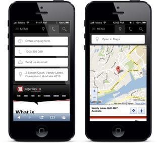
More people now have mobile phones than desktop computers and just because they can see your website on a mobile phone doesn't mean it is mobile-friendly! A mobile-friendly website will help get more leads and generate more sales from those customers who are on the move.

Thumb friendly

People will use their fingers to browse your website, and desktop sites don't make this easy. With Bloomtools your website is displayed differently when a mobile user accesses your site.

All the tools on your website are displayed with different layouts with a focus on bigger buttons and fonts

The navigation is clear and you can even have a different menu to your main site, and it includes a search feature


Make it easy for visitors to become customers

This may seem obvious however smart phones facilitate actions that are native to the phone by allowing the user to find you on a map or call you directly. Bloomtools makes this easy with big buttons to:

  • Find each of your offices on the phone's map app; and
  • Call you directly by clicking one button

One website, multiple devices

At Jasper Design we believe that mobile isn't an add-on it is a requirement for every businesses, with Smartphone usage being the fastest growing consumer medium the world has ever seen.

As a result every website that we build includes a mobile website, by default, with all the features you have read about above. And  best of all, any of the tools you have purchased from us maintain their features across both devices.

Ready to build your dream website to capture mobile customers?

Start Today

CONTACT INFO

ADDRESS56 Fourth Street, Home Hill,
Queensland, Australia, 4806

POSTAL ADDRESSPO Box 32, Ayr, Queensland,
Australia, 4807

LATEST NEWS

Flat logo trend

Posted by Kellie Williams on 7 June 2019
Keeping inline with the new 'flat is cool' design trend, Google finally released an update to their logo...
Posted in:Logo Design  
< Previous | 1 | 2 | 3 | 4 | Next >

YOUTUBE

Bookmark SiteTell a FriendPrint