I saw the signWritten on the 1 June 2013 by Kellie Williams  "I saw the sign") People driving by have, on average, only 4 seconds to look at your signage.Gaining maximum impact with your sign design is vitally important, especially when you’re in retail. The great news is that in most cases the simplest signs are the most effective. Research shows that 50 percent of customers find businesses because of their building signage, and around three quarters have an impressions of a business and its products due to vehicle signage. Signs can basically convey your business image to customers, communicate what your business does and point out your location—all in all, a cost-effective way to market your brand. A stand-out sign is an important part of a successful business. It will not only increase your business visibility, answer your customers’ questions, but it will provide your organization with a sense of identity. So, what are the elements of a good sign? MessageA stand-out sign has one purpose: to deliver a message. And this message, in a creative way, must inform, alert, or direct customers into action. Tip: Make sure your sign has a reason to exist. ComprehensionA stand-out sign will be easily understood by the majority of potential customers. Tip: Use images or shapes as an effective way of conveying a message. SpeedA stand-out sign rapidly sends its message to customers. Marketing 101: Customers lack patience. They don’t want to study a sign that is busy with words or pictures. Therefore, use just enough text and images to effectively communicate your message, in the shortest time possible. Tip: people driving by have, on average, only four seconds to look at your signage. AttentionWhat good is a sign if no one sees it? A stand-out sign should capture the attention of potential customers, but never eclipse everything around it. It manages to grab attention, and at the same time, blend with its surroundings. Also, a stand-out sign can be read from a distance without fuss. It can also be clearly seen at low-light from different angles. Tip: Size is not the important factor - visibility is. A huge sign can be a distraction, or just a plain eyesore. NeatnessA stand-out sign is kept clean and presentable. Remember, the quality of your sign represents the quality of your business. Tip: renovate or replace your sign, if necessary, but always keep it neat. RespectA stand-out sign is not offensive and it doesn’t insult people. Tip: this applies to every aspect of visually communicating, ie. words, gender, race... PromotionA stand-out sign should, in some way, promote your business. It cold contains your business name or logo, perhaps your address or phone number. But no matter how you choose to promote the business, you must use your sign to advertise your business. It’s important that customers can associate your sign with your business. AppearanceA stand-out sign should be aesthetically pleasing. Poorly chosen images, colours and shapes can easily turn away potential customers. So if you don’t have the necessary skills, hire a professional to design your sign. ComplianceA stand-out sign must meet with council regulations. There may be local restrictions limiting the size or type of sign you wish to display. Tip: contact the Townsville City Council for more information. Never underestimate the impact of a great looking, easy to read stand-out sign. It is more than just a representative of your business - it IS your business. “The Law of Perception - Marketing is not a battle of products - it is a battle of perception”.  "Kellie Williams") Author:Kellie Williams Author:Kellie WilliamsAbout: Kellie studied Commercial Art over 25 years ago at James Cook University and has been working in the Printing and Media industries ever since. She has worked for screenprinters, printing companies and newspapers in North Queensland and now runs her own business, Jasper Design, servicing Qld and interstate clients. Connect via:LinkedIn |
PHONE0400 270 806
ADDRESS56 Fourth Street, Home Hill,
Queensland, Australia, 4806
POSTAL ADDRESSPO Box 32, Ayr, Queensland,
Australia, 4807
 "The Golden Ratio")
| Posted in:Logo DesignGraphic Design |
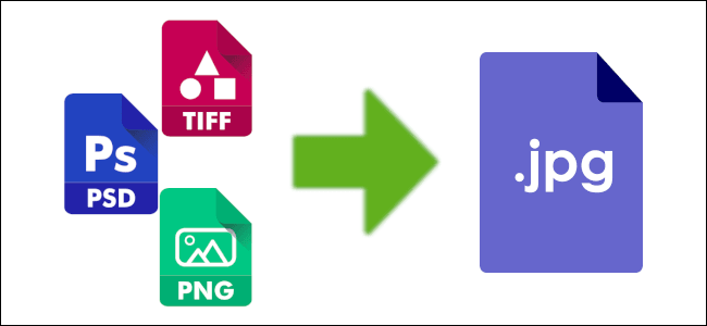 "Photo formats")
| Posted in:ComputersPhotography |
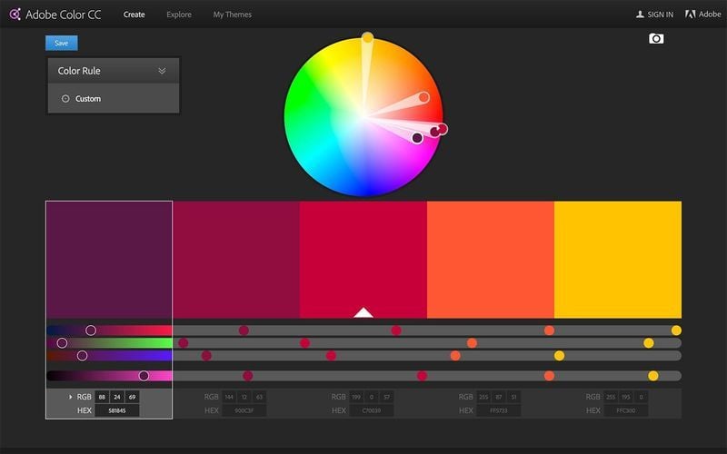 "Cool colours")
| Posted in:Logo DesignGraphic Design |
Home | Contact Us | Site Map | Print this page | RSS | |
