)
Mobile web design is different to its desktop brother. Even though you might have a website, it may not be friendly for your visitors who are using their smart phones when they're on the road, or want to fill their free time. Going mobile with your website is about function and speed, rather than pixel-perfection.
As more and more people have access to the internet on the go, it pays to tailor your site with mobile devices in mind. In fact, the statistics show that if the trend continues, in the future more people will be viewing your website via a mobile device than desktop or laptops.
The best mobile sites are elegant and clean. Investigate what people visiting your mobile friendly website actually want to see ask clients what's really important to them and consider what information users will want to access quickly, such as reservation information, menus and location maps on a restaurant website.
People who use the internet on the go are typically looking for specific information and they want it quickly. They want to know how to find you (get your mobile website to interact with their phones GPS), be able to easily call you (again with one click and the phone rings), and search your website and browse the menu. To achieve this, your mobile website needs to be different to your normal desktop website.
Sites with articles that regularly get shared should try to keep their work intact for those with smaller devices, but for most other businesses it pays to trim content. The attention span of users on a phone is shorter than for computer users, so it's worth getting to the main points quicker.
...but
Most users expect an equal and continuous journey across devices, so there is a strong argument that your mobile website should be a reflection of your desktop version.
Ideally your mobile website should be able to be managed through the same Content Management System (CMS) as your desktop website, with the option to use the same content or change certain pages to adjust to the different medium.
People will click the 'desktop version' link, particularly when served with a very limited mobile website, or a site that is substantially different structurally or visually to what they are used to, so try to keep the core content the same. Keep in mind how the user will move from one device to another and what that should mean for their experience.
As discussed, there are instances when someone will need access to your full site, so include a 'desktop version' link at the bottom of each page.
To make your site performs well on a phone there are a number of technical considerations. The first is that your site should automatically recognise when a mobile phone is being used to access it so the user can be redirected to a mobile version. You also need to think about elements like screen resolution, making buttons and links bigger than normal and removing some features, such as Flash, that do not work on most smartphones.
?Knowing what type of device people are viewing your mobile website on is key for guiding the design process and your mobile website strategy. Though many people have smartphones, don't assume that everyone does, or that they all have an iPhone or Android phone. Instead look into what devices your target audience actually are using with the help of analytics or research.
And while you do need to be mindful of the fact that not everyone is using the same device, don't get too hung up about it. The technology used on different mobile devices is fairly similar. Just remember that not everyone has the same screen resolution or input and your site will look different on different devices.
With all the different platforms out there, it's practically impossible to test on every possible combination of smartphone and operating system; new devices ship almost weekly, not to mention operating systems! But it is important to test across a general cross-section of devices, and you should aim to make this an ongoing process.
There's nothing worse than designing for iOS alone, then discovering at the end of your build that Android devices won't render your page as intended.
Another thing to consider is how your target audience use their phone, as well as if they have a reliable internet connection. The latter is particularly important if, for example, your users will fill in forms on their mobile devices.
There are a range of misconceptions regarding mobile website usage that can lead to misleading design decisions. One of the most common ones are how mobile users are always rushed and on the go, or that they're only interested in certain things when they use their mobile phones.
In fact, a big portion of mobile website usage happens when we have time to kill or when we're at home on the couch, and that impacts how you should approach things. It's better to base your design decisions on the theory that phones are used increasingly for the same tasks as a desktop, as this is actually what's already happening. But as much possible do research into the specifics for your target audience to understand what's true for them.
Limitations with your current website, like a lack of CMS, may make building a bespoke mobile website necessary, but if possible try to avoid building separate sites. In the long run these will be more costly and time consuming to maintain as it means doing changes twice.
Building something which works on as many devices as possible will provide you with the best setup for focusing your resources and budget on the content rather than maintenance.
Try to learn to use a device from a user's point of view. Test your design on that device and ask your clients to test it too, so you can see if there's any information that shouldn't be there or if anything's missing. User testing is always really important as well.
Accept and embrace the limitations. It's tempting to try to cram every last bit of functionality into a mobile-orientated website, but you need to accept that some things are better suited to desktop machines than portable devices. Conversely, mobile devices are far better at some things than desktops. Location-aware content, for example, is an ideal application for mobile.
Every image that gets added needs to get downloaded by the user. Because performance is so important on the mobile web, make sure the images you include are relevant to the user and will help them achieve their goals.
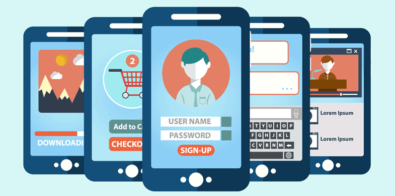
Interacting with the web through touch requires care and attention. You can't count on the precision of a cursor and instead need to accommodate for people's fat fingers. Make sure buttons, forms and other elements are large enough to interact with without fear of accidentally tapping/swiping on an adjacent element.
Mobile internet access is now a huge part of your customer's everyday life. As such, any business with an online presence should think carefully about having a thumb friendly mobile website for their business.
) Author:Kellie Williams
Author:Kellie Williams| Tags:Websites |
PHONE0400 270 806
ADDRESS56 Fourth Street, Home Hill,
Queensland, Australia, 4806
POSTAL ADDRESSPO Box 32, Ayr, Queensland,
Australia, 4807
)
| Posted in:Logo DesignGraphic Design |
)
| Posted in:ComputersPhotography |
)
| Posted in:Logo DesignGraphic Design |