
)
Putting a strategy in place that optimises your website for organic traffic from search engine results is your best bet for guaranteeing the increase of traffic to your site. Below are 5 simple and easy tips for doing this.
So the first step is to actually sit down and create (and then implement) your SEO strategy. This often stresses people out because they consider it to be an immediately time-consuming task that only shows results in the long term. In reality, this isn't the case. Once you understand the basics of building your SEO strategy, you'll be well on your way. New to SEO and how to utilise it on your site? There are literally hundreds of websites that offer self-help like moz.com/learn/seo
People often associate SEO and SEM with words like time-consuming, complicated, and long-term, but in reality SEO is much simpler than you might think. SEO is a combination of two factors: on-site content and off-site link backs. That means that your website content should be SEO friendly, with titles and headers that incorporate popular search terms so people can find your content, and you should get as many reputable websites as possible to link back and reference your site so your search ranking improves. Really there's not much more to it than that.
One of the best ways to drive traffic to your site is to create valuable and interesting content that is highly 'shareable' and relevant to a large group of people. Of paramount importance is having a clear and concise title for your blog or article. You want it to be so compelling that people cannot help themselves but click the link to view your content. You need that little one-liner to convey all the information about the content of the page while being seductive enough to get people to actually click on it. At the same time you don't want to just create a title that gets people to click on the link, but has absolutely nothing to do with the content of the page.
This is where keywords come into play. You could try using a keyword analysis tool like Google's Keywords Tool to find out which terms related to your industry are the most highly searched for on the web. From there you can list the relevant terms that relate to the content of your post, helping you to craft an interesting title that incorporates highly searched for keywords. Then, when someone is looking for an article on your subject, they'll be able to find it.
And once they've clicked your seductively worded title and landed on your page, the content should excite (or at least amuse!) them so much that they have an intense desire to share your awesomely amazing content with the rest of the world! (see next point)
Social Media is a great way of getting your name out there and helping people discover your posts and products. RSS feeds, social networking sites like Twitter and Facebook, and blogging can all be considered a part of social media. Utilizing many of these outlets and channels can help you reach a larger audience and help promote your content when users share and distribute your content.
It's best practice to make it as easy as possible for people to share the content on your site. Have "buttons" or links to help people who come to your site drive even more traffic to your site, by sharing your content on Twitter, Facebook, and other channels.Also check out: StumbleUpon, Chime.in, Digg, Reddit, Slashdot, Newsvine and Pinterest!
One of the best ways to drive traffic to your site is to target influencers in a particular industry to try and get them to help you increase your audience. The best way to do this is to form a mutually beneficial relationship with influencers, by sharing their posts and content, or advertising for them on your site. You want to create a relationship that will make both of you happy.
Advertise: Offer specials in advertising on your site or free advertising if other sites feature you.
Social Broadcasting: If you have a large Twitter or Facebook following, offer to Tweet about other's websites or posts. In return they can do the same for you.(Email me for some resources if you're still having trouble crafting a catchy title to highlight the awesome content of your post, or if you can't figure out what to write about in the first place to drive traffic to your site.)
| Posted in:MarketingWebsitesWebsite TrafficSEO |
)
Your logo should stand out and be recognized among others in the same market place. And keep in mind that a logo doesn't necessarily need to say what a company does. "The Mercedes logo isn't a car. The Virgin Atlantic logo isn't an aeroplane. The Apple logo isn't a computer," writes graphic designer David Airey on the popular logo design site Logo Design Love. So don't feel like your coffee shop's logo needs to show coffee beans.

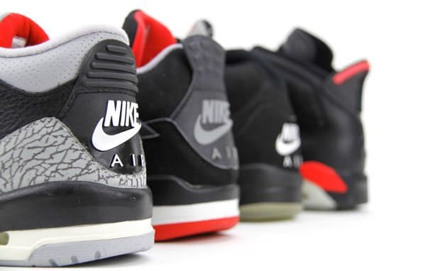
Strong logos translate well across different mediums. Will your logo have the same meaning on a business card as it will on a billboard? "Keeping the design simple allows for flexibility in size," writes Airey. "Ideally, your design should work at a minimum of around one inch without loss of detail." When a logo does not reproduce well on a small scale it causes problems for your brand's clarity and value. Also keep in mind that it should reproduce well when faxed in black and white, and when embroidered on your work shirts.
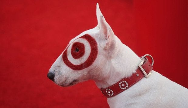
Who is your target audience? A logo needs to accurately reflect a company's culture and values: the company's essence. "Designing for a lawyer? Ditch the fun approach. Designing for a kid's TV show? Nothing too serious," writes Airey. Doing some market research is critical, too. Colour can be a major attribute in determining the appropriateness of a logo design. We all know that different colors are associated with different meanings in different cultures. It's important to think about how the colors in your logo reflect your brand values and the services or products you sell.
In 1971 graphic design student Carolyn Davidson designed Nike's 'swoosh' logo. In 1995, Nike began using the stand-alone Swoosh (without the lettering) as its corporate logo, and continues to use it that way today. It's the neutrality of a design that makes a logo timeless - clean lines, modernist structure and neutrality.
| Posted in:Logo Design |
)
Some businesses spend serious amounts of money having their vehicles sign-written, and in some cases fully vinyl wrapped, but just put the business name, logo and phone number, with absolutely NO information about what they do, or any reason why you should call them!
BORING!
Look at your work vehicles today and ask yourself: If a passer-by didn't know anything about this business would they:
I've seen vehicles with logos on all sides, but the business name doesn't give the first clue to what the business does or what problems it solves, and there was no tagline or mission statement to give any hints.
Others do have a tagline...but the tagline was "Serving the local community" Umm...serving them by doing WHAT?!
Here's a thought if your tagline could apply to any business, not just yours, (even worse, if it could apply to a completely different industry) then it's POINTLESS. Ditch it immediately and think of something that expresses your USP Unique Selling Point.
So, is your business missing a massive mobile marketing opportunity to get more business?
Here's some questions if you've got a business vehicle of any description:
One last thing don't make any text so small that you need to be too close to the back of the vehicle to read it. Remember, traffic is doing 60+ km/hr you do not want them to get 1 metre from your bumper to find out if your business might be worth contacting!
| Posted in:SignageMarketingCar SignageUSP |
However, there are a handful of wine companies who really go that extra mile when it comes to designing and printing labels for their bottles. Here are some of my favourites.
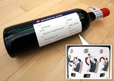
Many people indulge in a bottle of wine during a long flight and this exceptionally creative label design makes that experience even more fun. The wine label is essentially designed in the style of a boarding pass with essential boarding information replaced with wine information. It looks great and no doubt goes down well onboard.
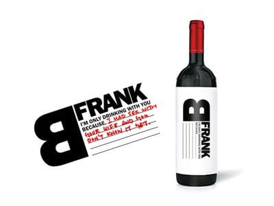
This label is only half designed for you; you have to do the other half yourself. B Frank Wine allows you to fill in the label yourself and let your co-drinker know why you're drinking with them. For example, "I'm only drinking with you becauseI'm about to fire you and you don't know it yet". The design is minimal and makes drinking a great wine even more fun!
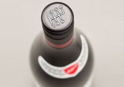
Elderton Wines of Australia has bottled a wine in tribute to auto (and wine) enthusiast Neil Ashmead. The Neil Ashmead GTS, or "Grand Tourer Shiraz" features a racing-styled label bearing Ashmead's signature. The bottle's coolest attribute, however, is its' six-speed stick shift screw-on cap. It just makes you want to grab it like a gear shift and pretend to drive!
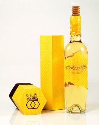
Lauren Golembiewski created the Honey Moon Wine concept as an annual gift to past and prospective clients in celebration of a budding summer. The "honey moon" is the first full moon of the month of June, known as the perfect moment to begin the harvest of honey. While the bottle is certainly an achievement of its own, Golembiewski also created the honey moon font to go with the label.
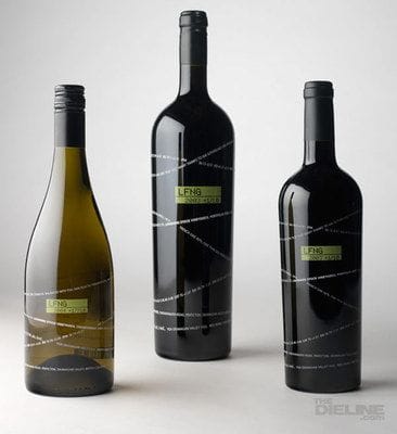
The designers at Laughing Stock Wine took a literal approach to designing their label. A stock ticker twists and wraps around the bottle, displaying the basic details of the wine contained within - very quirky. The name of the wine is displayed as a stock symbol, "LFNG", with the vintage year below it. In all, the design does an excellent job of conveying the character of the brand.
Do you have a favourite label?
| Posted in:MarketingPackage design |
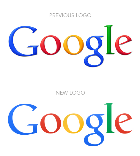
Keeping inline with the new 'flat is cool' design trend, Google finally released an update to their logo along with a cleaner home page for most users.
It's new flattened logo is cleaner, which is a much needed attribute when using a serif typeface and many colors.
The shadows and bevelling have been removed from the primary coloured lettering of the logo for a flatter appearance, while the colours are slightly more muted to give a more modern look.
Here's an excerpt from an interesting blog I read on this new trend of flat design:
The term "Flat Design" gets its origins from the fact that it removes most if not all traces of drop-shadows, flashy gradients and extraneous textures from the visual design. Everything looks "flat", rather than beveled, bulged, clickable, or inset.
On one hand this is a good thing, because it forces designers to focus on the content as the most central part of our design. It forces us to think about how to present the content in such a simple and compelling way that really gets to the heart of the issues and needs of our users.
Where it can turn ugly is when a designer takes this style to an extreme and removes all user-guides and suggestions from an element. You can see this on some websites where it's hard to tell what is a button, or a clickable link.The worst example would be a button to buy a product, except there's no way to tell it's a button unless you actually start clicking around. When you hover or "press" the button, nothing happens there is no visual indication that something is happening or will happen in response to your action.
This is very frustrating to users it's just all around bad usability.
Another important aspect of the Flat Design style is a strong focus on color. Rather than limiting colors to the long-overused tones of "business blue" and "metallic chrome", designers are experimenting with newer shades like web green, peachy red, and lilac purple.
As you know, colors are very powerful, and can mean the difference between an engaging design and something that offends or puts off your users.The one thing to remember here is to not use a color just because you see it on another "cool" site. You really need to think about the company or product you are designing for, and what their message is.
So don't simply grab the hex value of the latest and greatest "web green" design and plug it into your design. Do some research, find out what you want to portray with your visual design and then choose your colors accordingly.Your color guide should be a lot different if you are working with say JCP or Vogue verses a large construction or demolition firm.
Good typography is a key foundation of Flat Design. Because you have stripped away all the extra visual "fluff and shine", there is a lot of room for really good typography to shine.
Webfonts have been around for several years, but we are only beginning to scratch the surface of what can be accomplished with them. More and more web designers are beginning to look to print for typographic inspiration. Web typography is getting better, but we still have a long way to go.
Typography is one of those things that when done well really exemplifies the message of the site. Instead of drawing attention to the fonts, you are drawn to the content and purpose of the article or app.The disturbing fact about many websites is that good typography is often undervalued and tacked-on after the fact. Designers and clients alike have not given much attention to typography and taken advantage of its power.
In order to effectively communicate your message, as much time and effort must be spent on the typography as you spend on picking colors, and pushing-pixels to get things looking just right.
You can read the whole blog by Caleb Mellas here.
| Posted in:Logo Design |
PHONE0400 270 806
ADDRESS56 Fourth Street, Home Hill,
Queensland, Australia, 4806
POSTAL ADDRESSPO Box 32, Ayr, Queensland,
Australia, 4807
)
| Posted in:Logo DesignGraphic Design |
)
| Posted in:ComputersPhotography |
)
| Posted in:Logo DesignGraphic Design |